Introduction
To create a more reliable machine learning model, it is crucial to have substantial quantities of high-quality data. However, it is common for data to be flawed, containing missing information, duplicates, outliers, and inconsistencies. Therefore, preparing the data becomes a vital process in obtaining pristine data. Without proper data preparation, the outcome of the model would be unreliable and ineffective.
There are several alternatives to handle data preparation but AWS SageMaker Data Wrangler is the fastest and easiest way to prepare tabular and image data for machine learning. You can easily handle data selection, cleansing, exploration, and visualization from a single user-friendly UI interface.
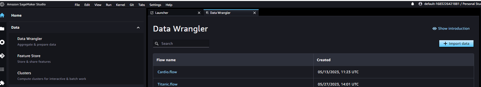
You can reach the tool under SageMaker Studio -> Data -> Data Wrangler
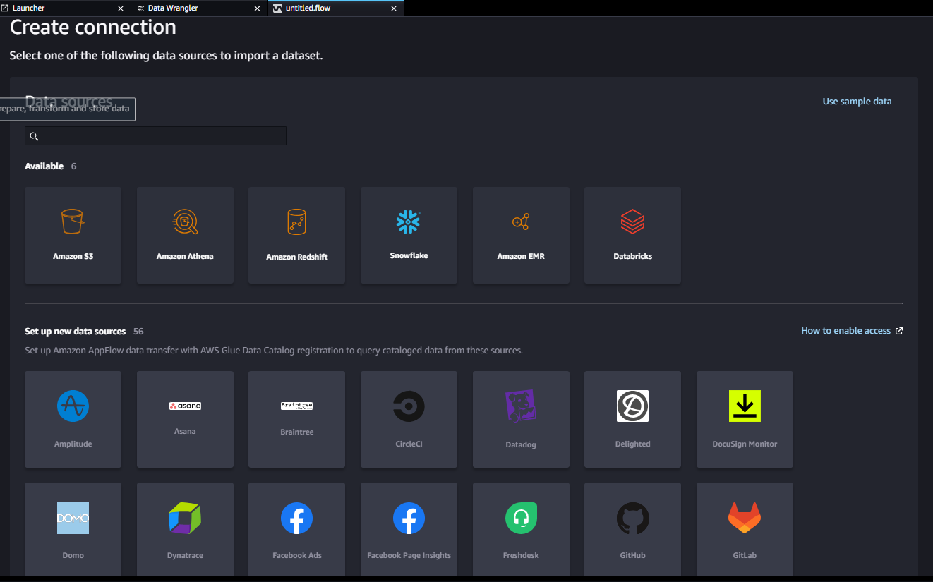
First step is importing data/accessing data
You can quickly access and select data from a variety of sources - Amazon Simple Storage Service (S3), Amazon Athena, Amazon Redshift, AWS Lake Formation, Amazon EMR, Snowflake, and Databricks Delta Lake and over 50 other third-party sources -such as Salesforce, SAP, Facebook Ads, and Google Analytics. You can also import various file formats, such as CSV, Parquet, ORC, and JSON, and database tables.
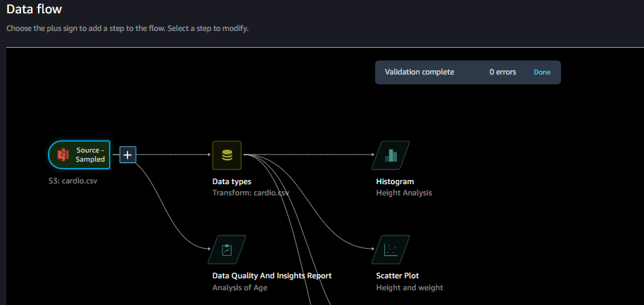
Second Step is Data Flow or Exploring Data Quality
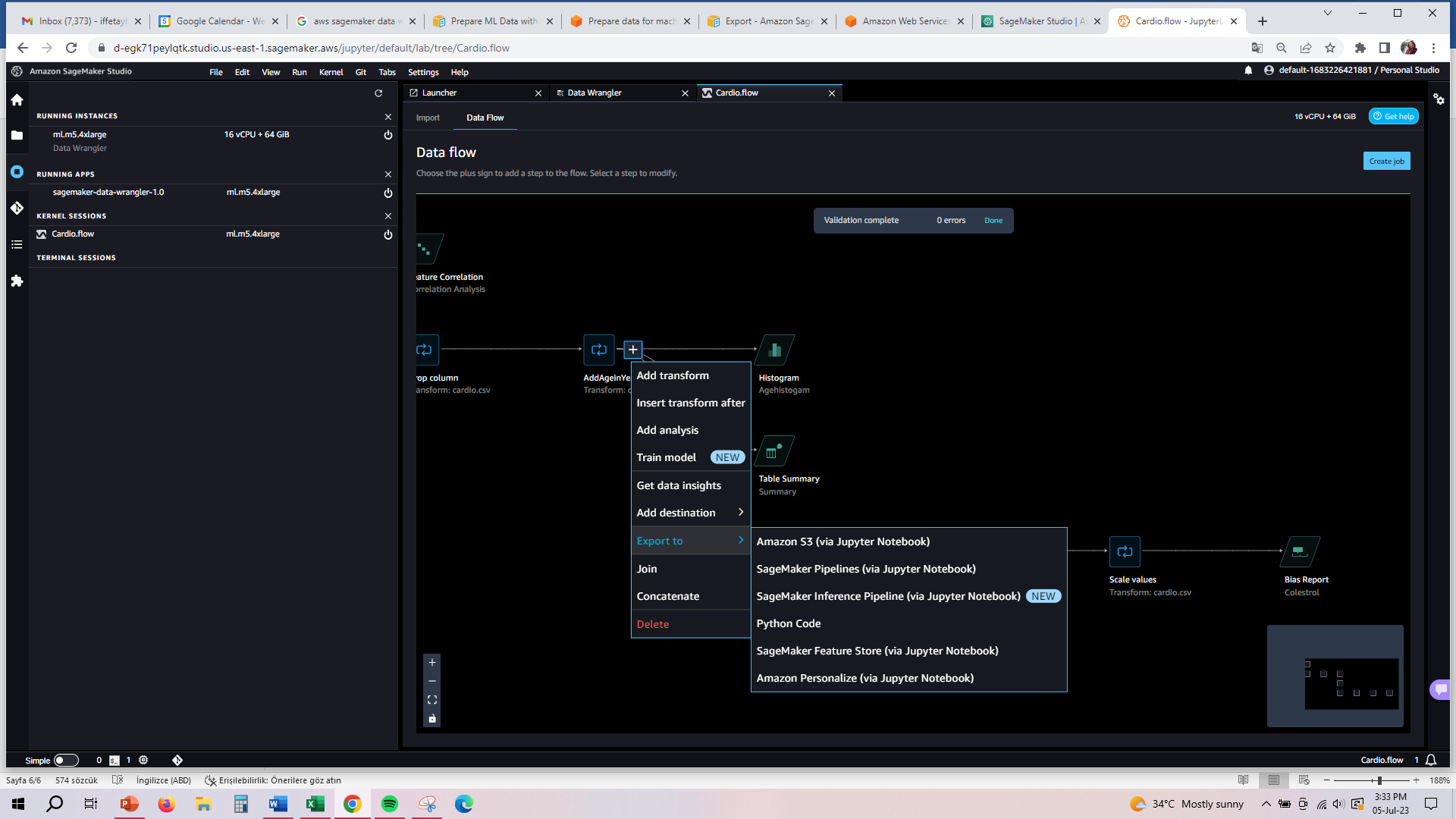
The data flow connects the datasets, transformations, and analyses, or steps, you create and can be used to define your pipeline. The data flow UI is easy to use and when you import a dataset, the original dataset appears on the data flow and then you can add new steps by pressing “+” sign.
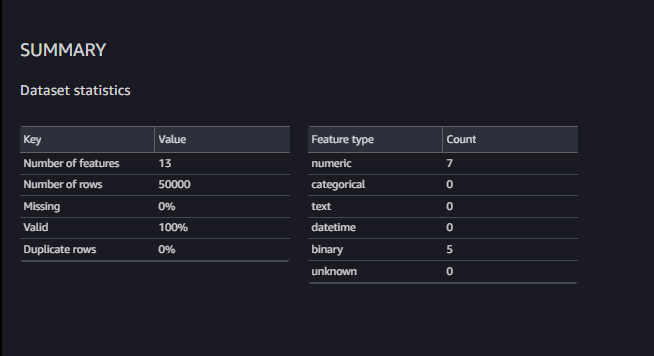
SageMaker Data Wrangler provides a Data Quality and Insights report that automatically verifies data quality (such as missing values, duplicate rows, and data types) and helps detect anomalies (such as outliers, class imbalance, and data leakage) in your data.
There is a summary of missing info, duplicates and anomalies:
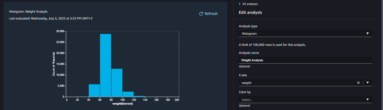
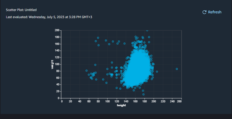
Also it is possible to visualize the data with histograms, scatter plot, box plot, line plot and bar charts.
Histogram shows the distribution of the data in one feature:
Scatter Plot diagrams show the relationship between features:
It is possible to run Feature Correlation Report and understand which features are impacting the results. If the correlation of the field is around 0 means there is no correlation, if the correlation close to 1 means perfect correlation.

Third Step is Transforming the Data
Most of the time, there might some duplicate records or missing fields in the data. Without coding you can easily handle these tasks.
Some of the mostly used features are:
- Remove Duplicates: Remove duplicate records if necessary, please note that check the duplicates before removing columns especially ids.
- Manage Columns: When you checked Feature Correlation and find 0 values means these columns are not correlated with model then remove these columns by manage columns.
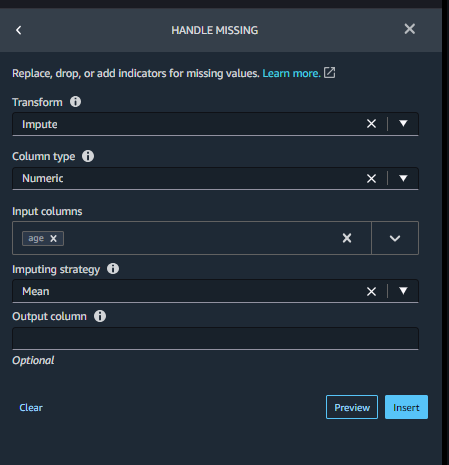
- Handle Missing: If you will have missing info on the fields and if the field is not so critical in model, then you can replace null value with average of the field value. For example if the age info is null, you can replace with Mean of Age.
- Encode Categorical: If you have categorical data then you need to convert them to numerical with one-hot encoding.
- Custom Transform: There are hundreds of transformations available but still you may need to create and use custom codes. You can use Python libraries PySpark, pandas, or PySpark (SQL) to define custom transformations.
Fourth Step is Exporting
Export your data preparation workflow to a different location. The following are example locations:
- Amazon Simple Storage Service (Amazon S3) bucket
- Amazon SageMaker Model Building Pipelines – Use SageMaker Pipelines to automate model deployment. You can export the data that you've transformed directly to the pipelines.
- Amazon SageMaker Feature Store – Store the features and their data in a centralized store.
- Python script – Store the data and their transformations in a Python script for your custom workflows
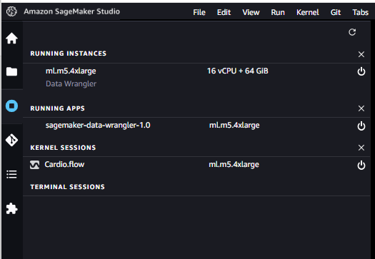
Fifth Step is Shutting Down Data Wrangler Instance
Under Running Instances, select the shutdown icon next to this app